
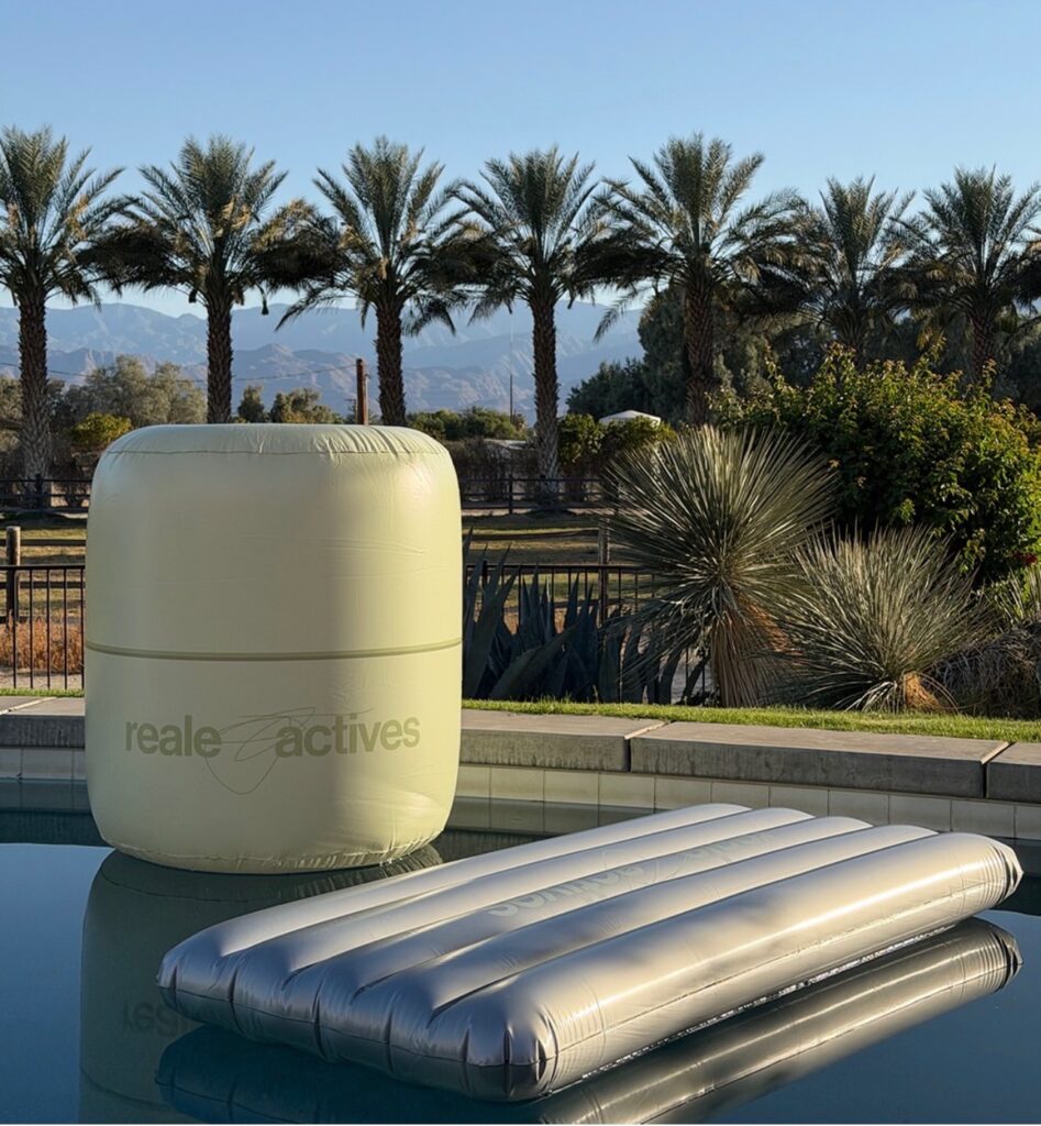
If you saw a giant silver bottle floating on your FYP, you weren’t hallucinating—you were witnessing the “Silver Takeover.” Alix Earle’s skincare debut, Reale Actives, didn’t just join the Coachella conversation; it hijacked the entire narrative. Launching on March 31, just as desert heat and festival “FOMO” reached a fever pitch, the timing was a masterclass in strategic positioning. While other brands were busy begging for tags in “GRWM” videos, Reale Actives was building a literal monument to its own hype.
The Strategy: Competitive Presence & “Main Character” Energy
The marketing team demonstrated a sharp tactical edge by refusing to blend in with the boho-chic leftovers of festivals past. Eschewing standard floral displays, Reale Actives entered the space ready to challenge legacy skincare giants.
They didn’t just want a seat at the table; they wanted to be the table. By leveraging Earle’s transparent history with cystic acne, the brand transformed from a “celebrity vanity project” into a dominant festival fixture, trading traditional clinical “boringness” for high-gloss dominance.
Reale Actives: The “Silver Landmark”
By aligning the grand reveal with one of the year’s most significant cultural events, the marketing team maximized visibility and captured an audience already primed for high-impact content. They differentiated themselves through immersive activations that transitioned the brand from a newcomer into a definitive landmark.
The Vibe: High-Gloss, Futuristic, and “Newstalgic”
The aesthetic was unmistakable: a seamless blend of 2010s playfulness and 2026 luxury chrome.
The Hero Moment: A 20-foot tall Mandelic Acid Bouncy House. They shifted away from standard clinical marketing, turning a serious skincare product into a playful, interactive monument.
Product-as-Architecture: A highlight of the weekend, the entire structure was custom-shaped to mirror the exact silhouette and signature color of the product bottle.
The Poolside Presence: The branding extended to the water, where products were reimagined as oversized, high-fashion pool inflatables. Every detail was designed to turn the physical product into a larger-than-life experience.
The Impact
By moving away from static signage and leaning into “Product-as-Architecture,” Reale Actives turned their physical space into a silver playground. This approach ensured that the activation was inherently shareable, effectively turning guests into a secondary marketing force. It served as a high-gloss example of how a new label can utilize a major event to establish a distinct, authoritative identity within a crowded market.
@realeactives she’s just drifting into desert wind 💨
♬ she was a fairy - 𝓐ngel